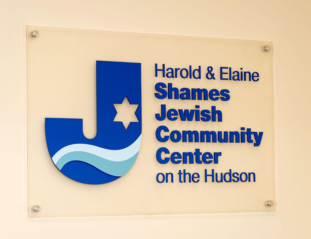
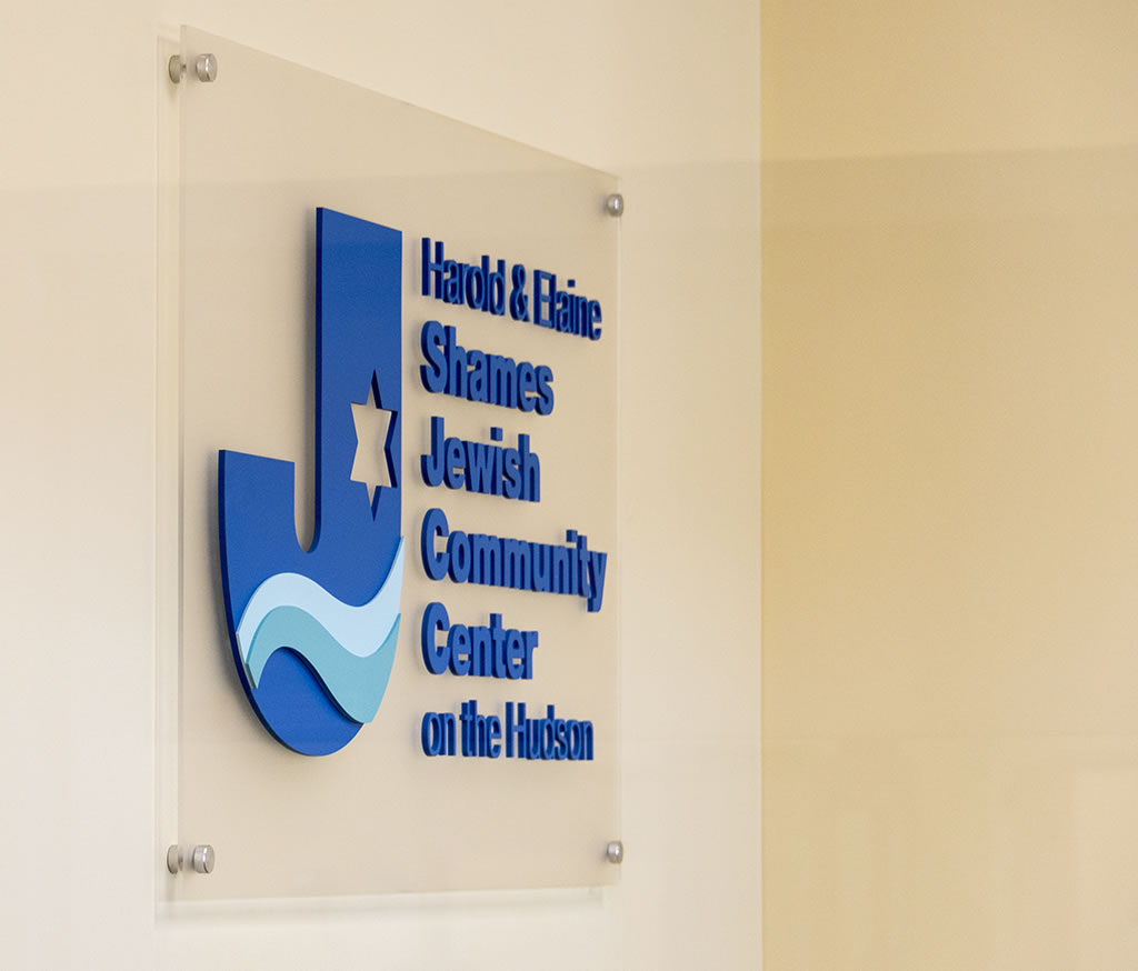
Shames JCC on the Hudson's new building
A few years back, the JCC on the Hudson in Tarrytown NY raised enough money to buy an old building next door to their orignal facility. The new building was to be renovated as an expanded community center for JCC members. It was finished and opened to the public on June 7, 2017. Along with colleagues at Roher/Sprague Partners I did a lot of design work and signage for the new building. We worked both with the owners of the building as well as the architects that were designing new structures to merge and expand the facility.
Exterior Identification
East Wall facing Broadway
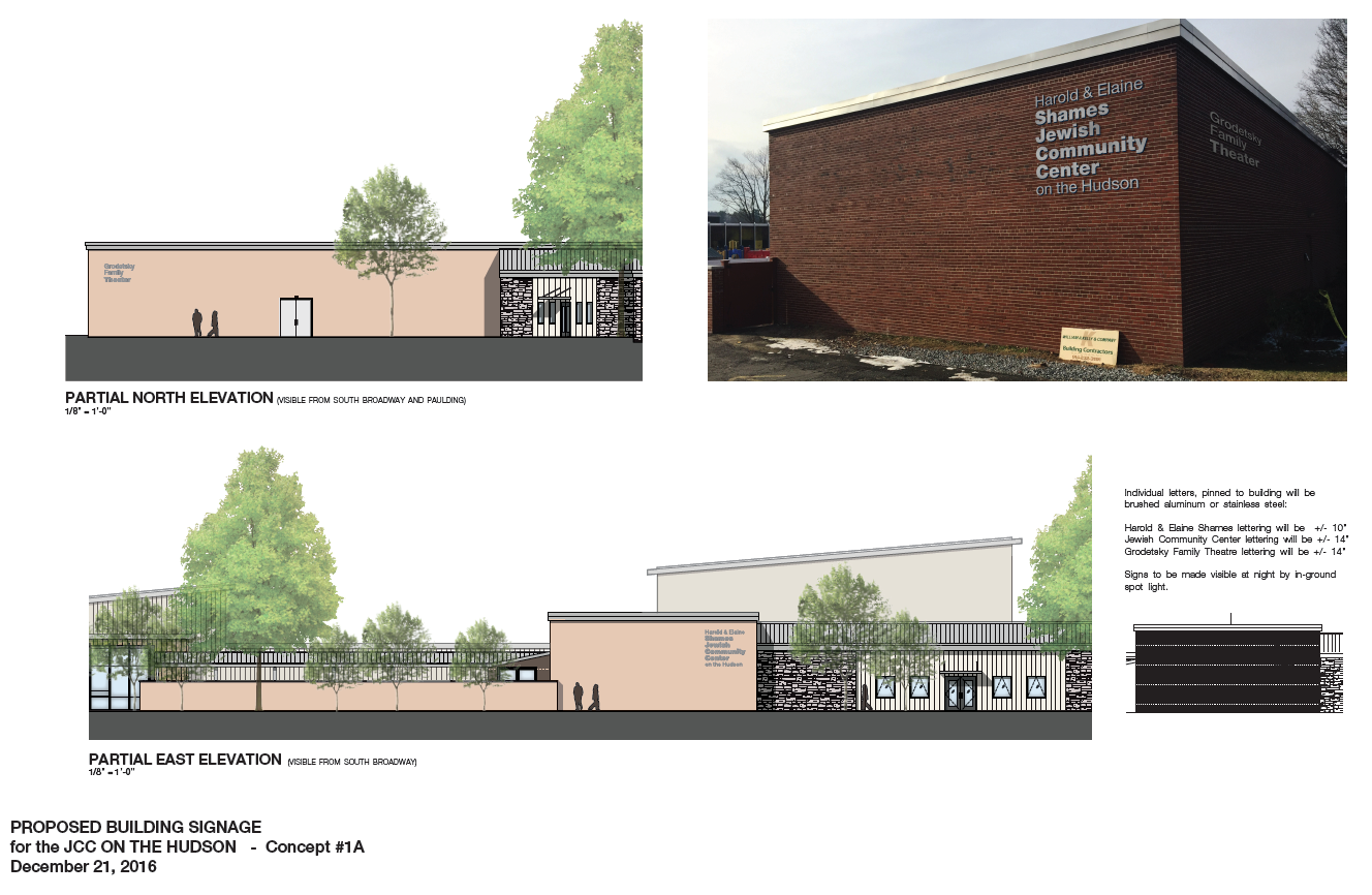
Concepts
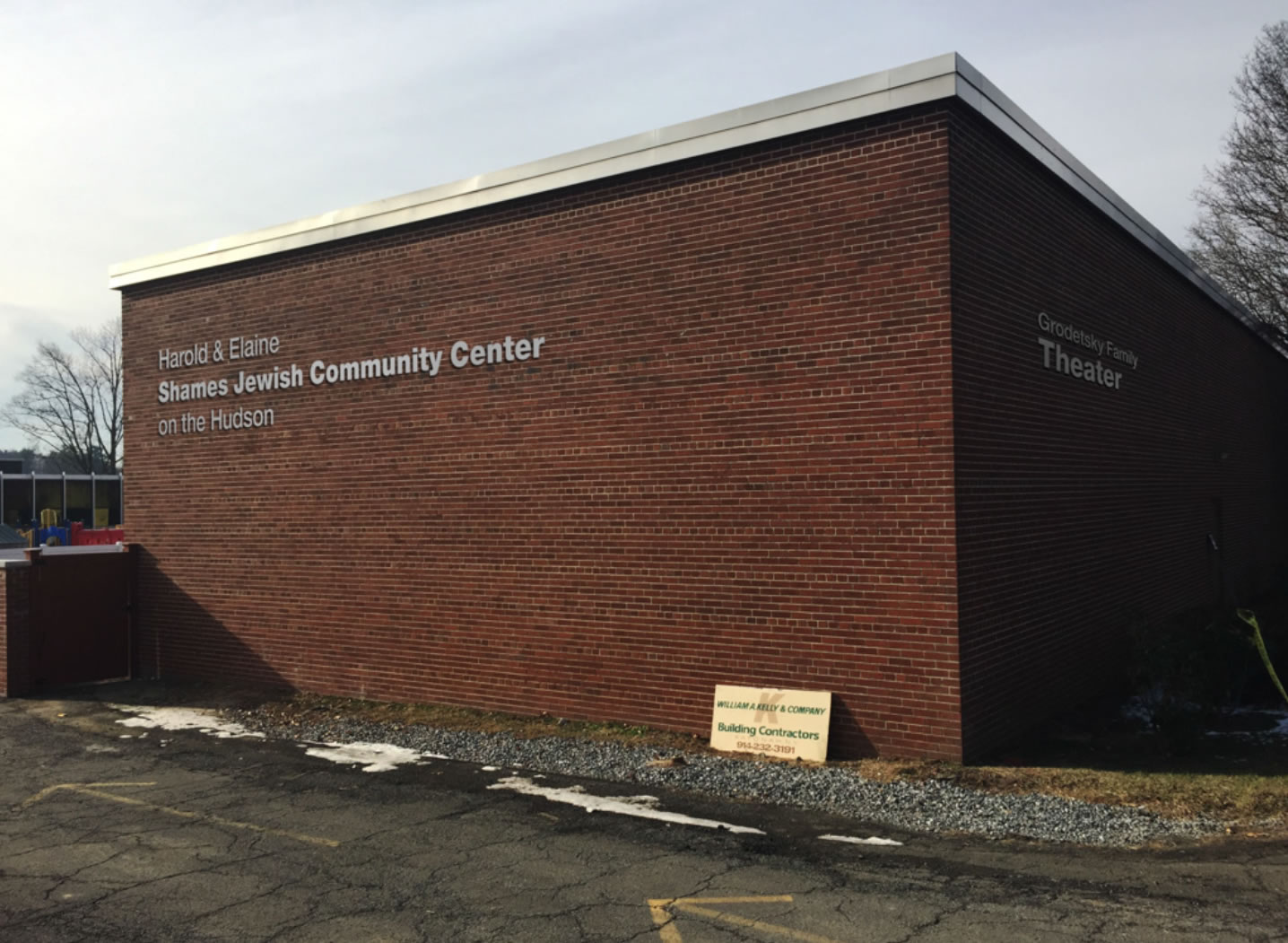
Signage design concepts were created using both the architect's elevation drawings as well as photo composites. This is the wall that faces the main street that people will be driving down.
Finished
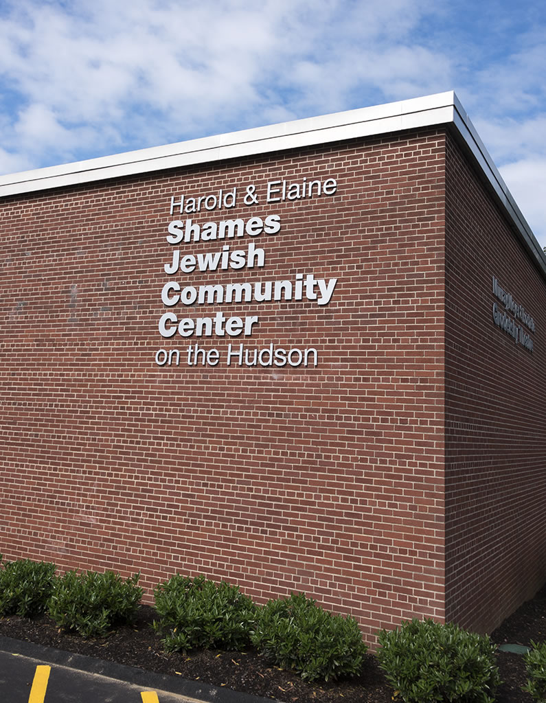
The finished product looks almost exactly like my Photoshop mockups. Each letter was made out of metal and pinned to the bricks.
South Entrance
Concepts
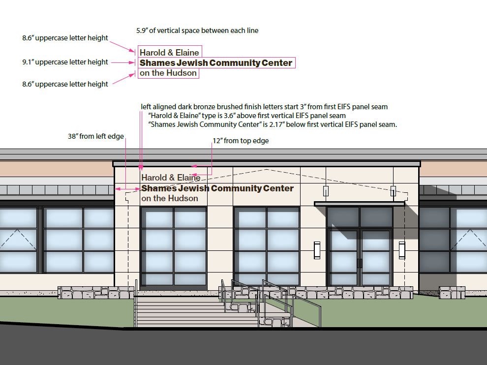
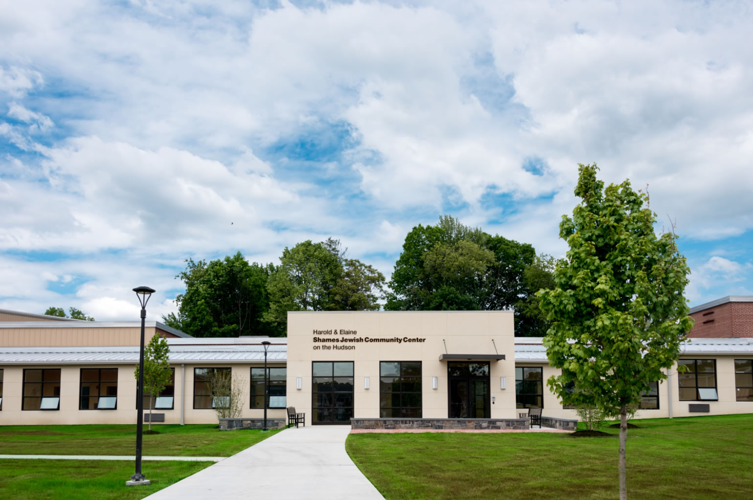
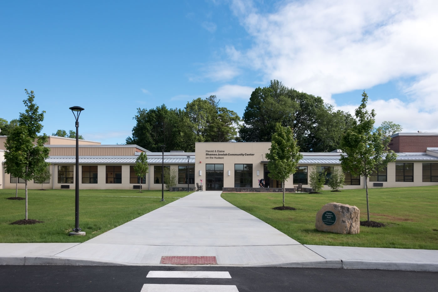
The south entrance is meant to be the primary entrance to the new building with a lawn area and parking. This section had to be built, so at first we used architectural drawings for the concept designs, and then later added the design to a photograph for a more realistic representation. However, this is when I noticed that the facade that was drawn in the architectural drawings had different dimensions compared to what had actually been built.
Finished
The sign still looks great on the slightly-different-sized facade anyway.
West Entrance
Concepts
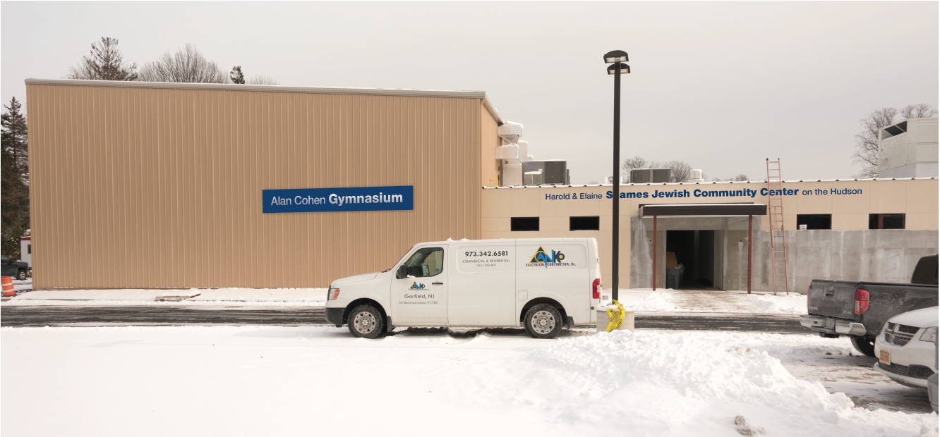
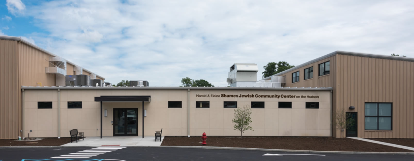
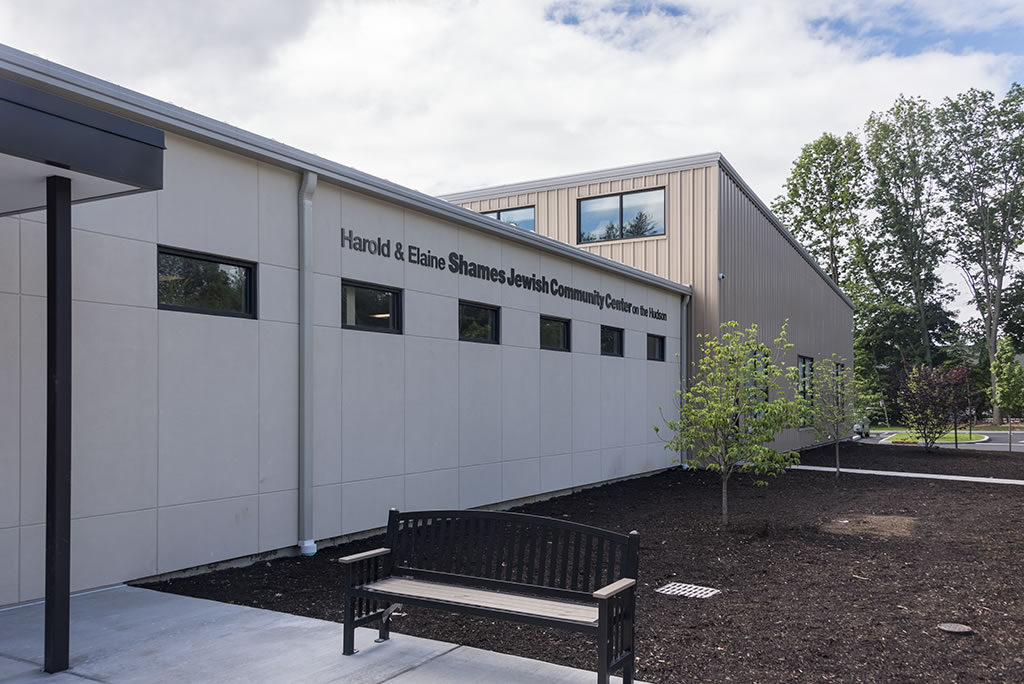
The west entrance is in the back where there's another parking lot area. Some of our concepts label the gymnasium area as well, but this was later decided against. We also had to re-design a bit as the architecture evolved since some things like gutter drains weren't on the original architect's drawings.
Finished
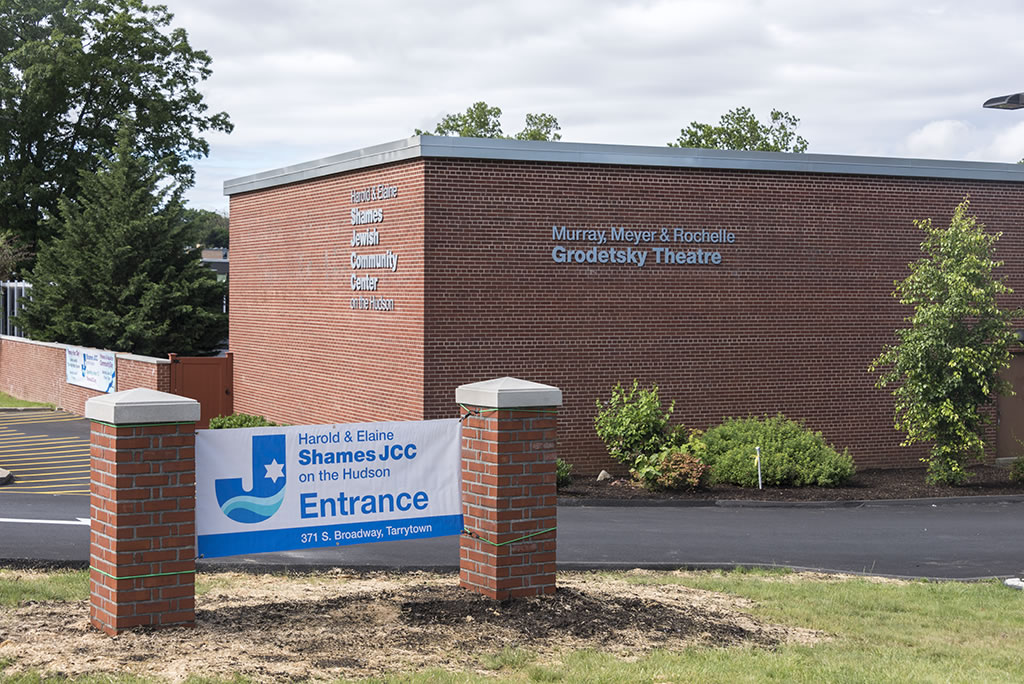
Entrance sign
Concepts
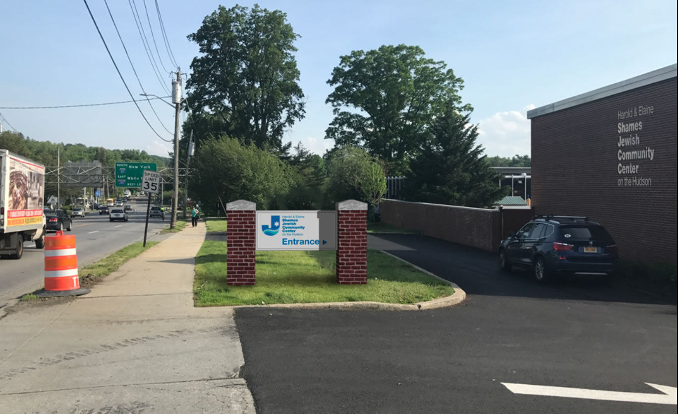
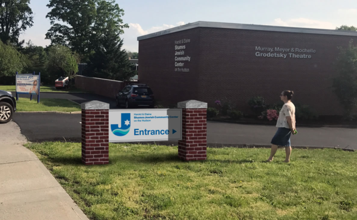
For the entrance pillars sign, I created numerous 3D mockups and composited them with photos of the area.
Finished
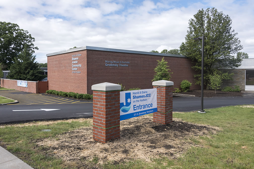
This isn't the final final sign as the banner held between the posts was replaced with a real sign and metal mounts.
Donor Recognition
Legacy Leaders & Builders' Circle
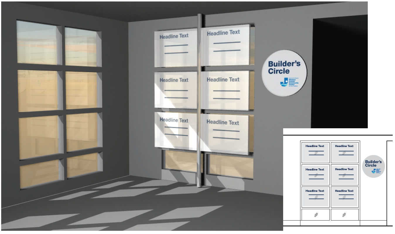
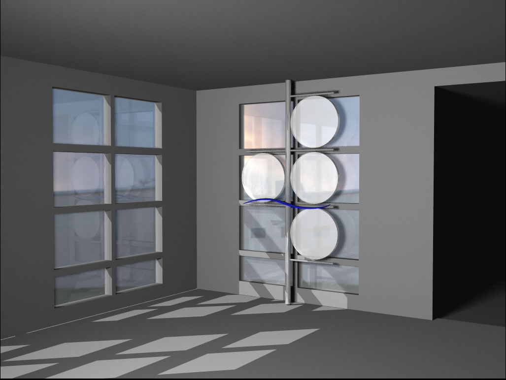
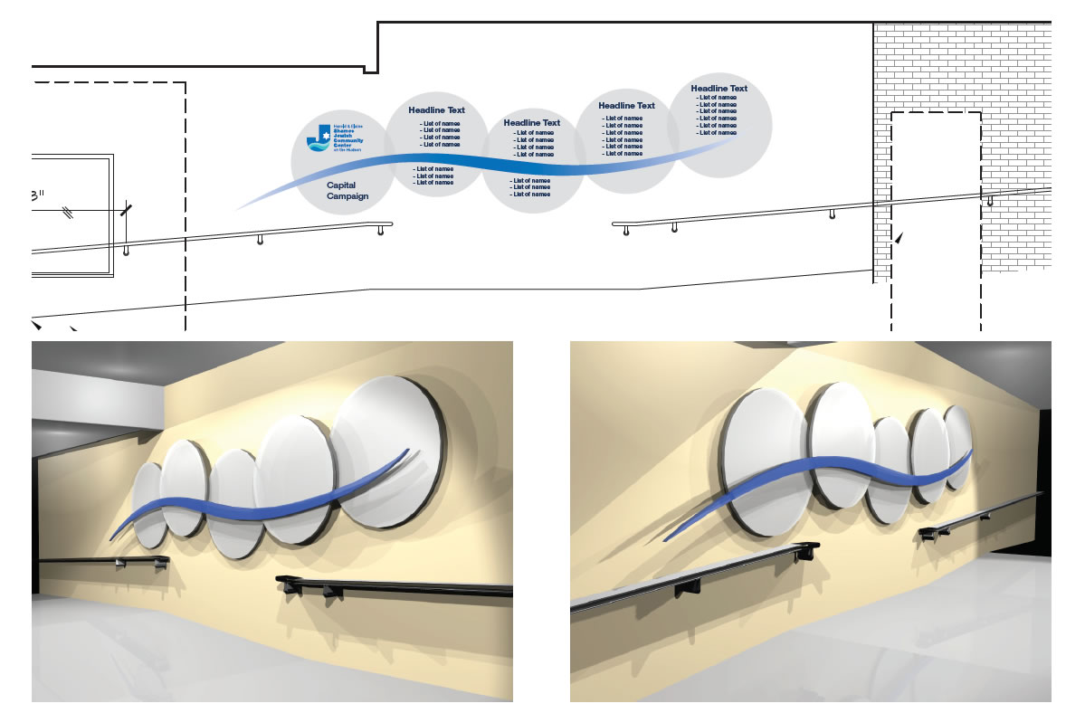
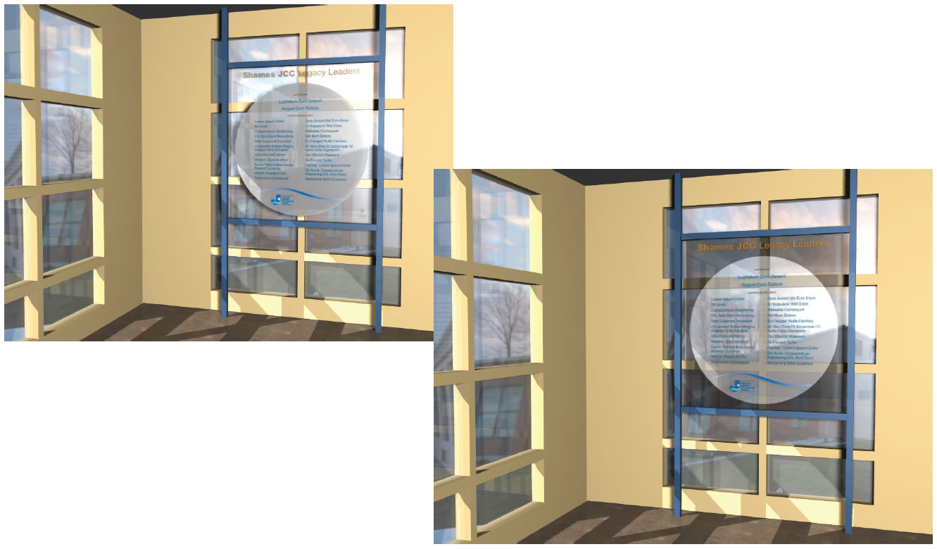
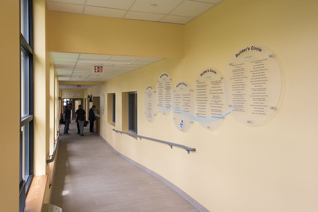
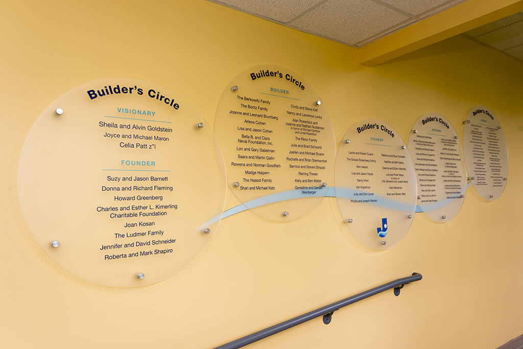
The Legacy Leaders are the donors who contributed the most to the building of the new Shames JCC, so they got the most prominant panel display. The Builders' Circle is a series of 5 other categories of donor names organized by how much they contributed to the new building.
Concepts
We went through a lot of different options in designing the donor walls both in terms of structural shapes as well as internal hallway/lobby locations.
Finished
The finished version puts the top donors right next to the entrance reception desk, while the other "Builders Circle" panels appear a bit further down the hall.
Donor Rooms
Concepts
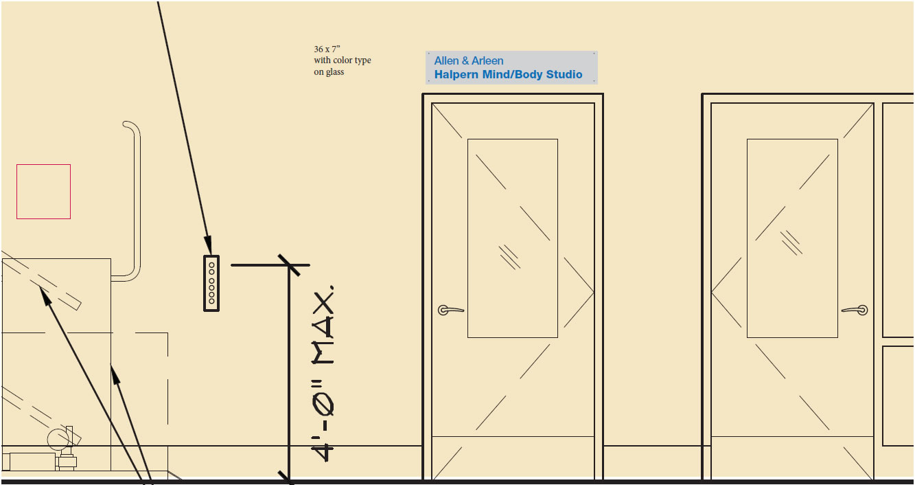
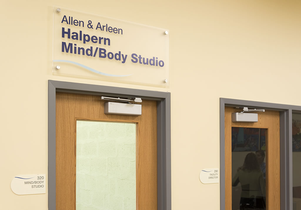
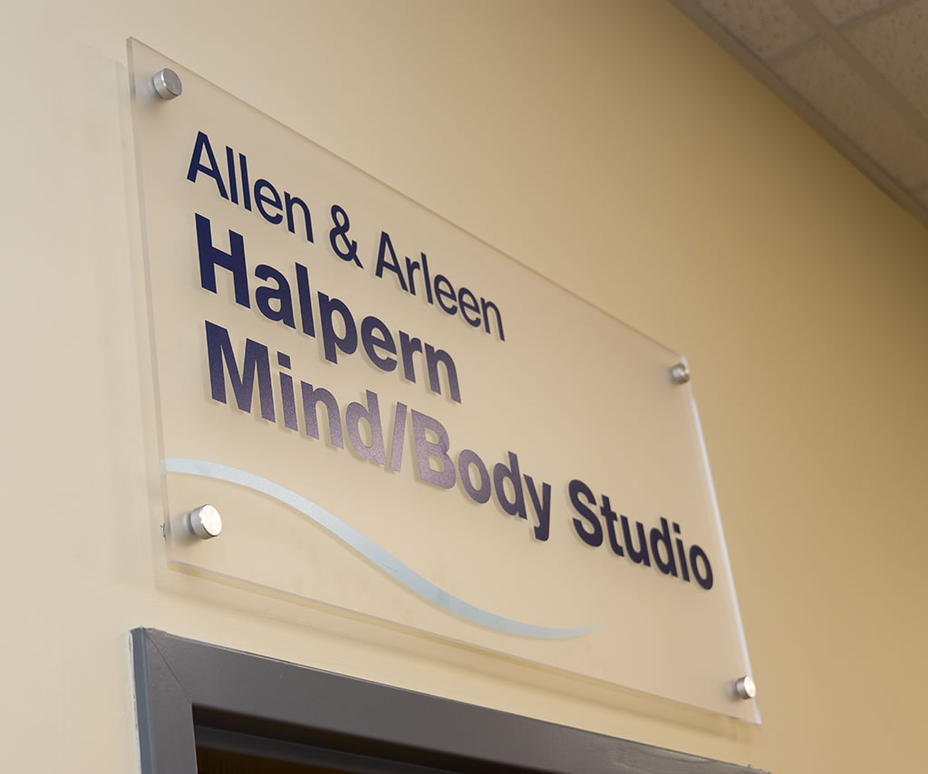
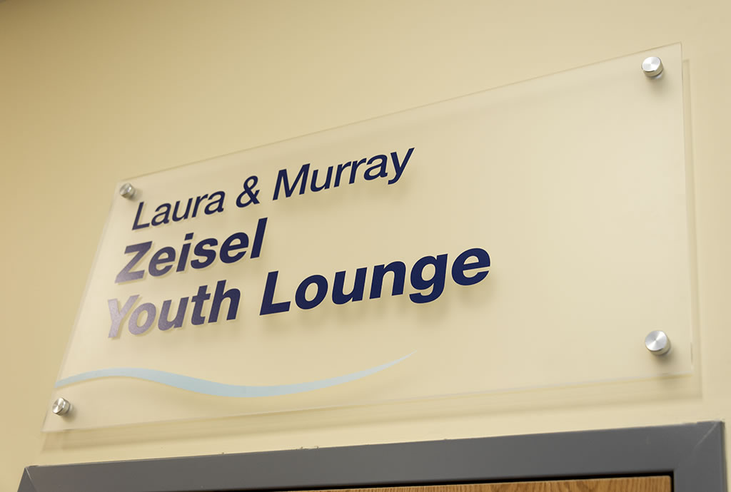
Some donors contributed enough to get specific rooms named, so we did special signage treatments for those.
Finished
Cohen Gymnasium panels
Concepts
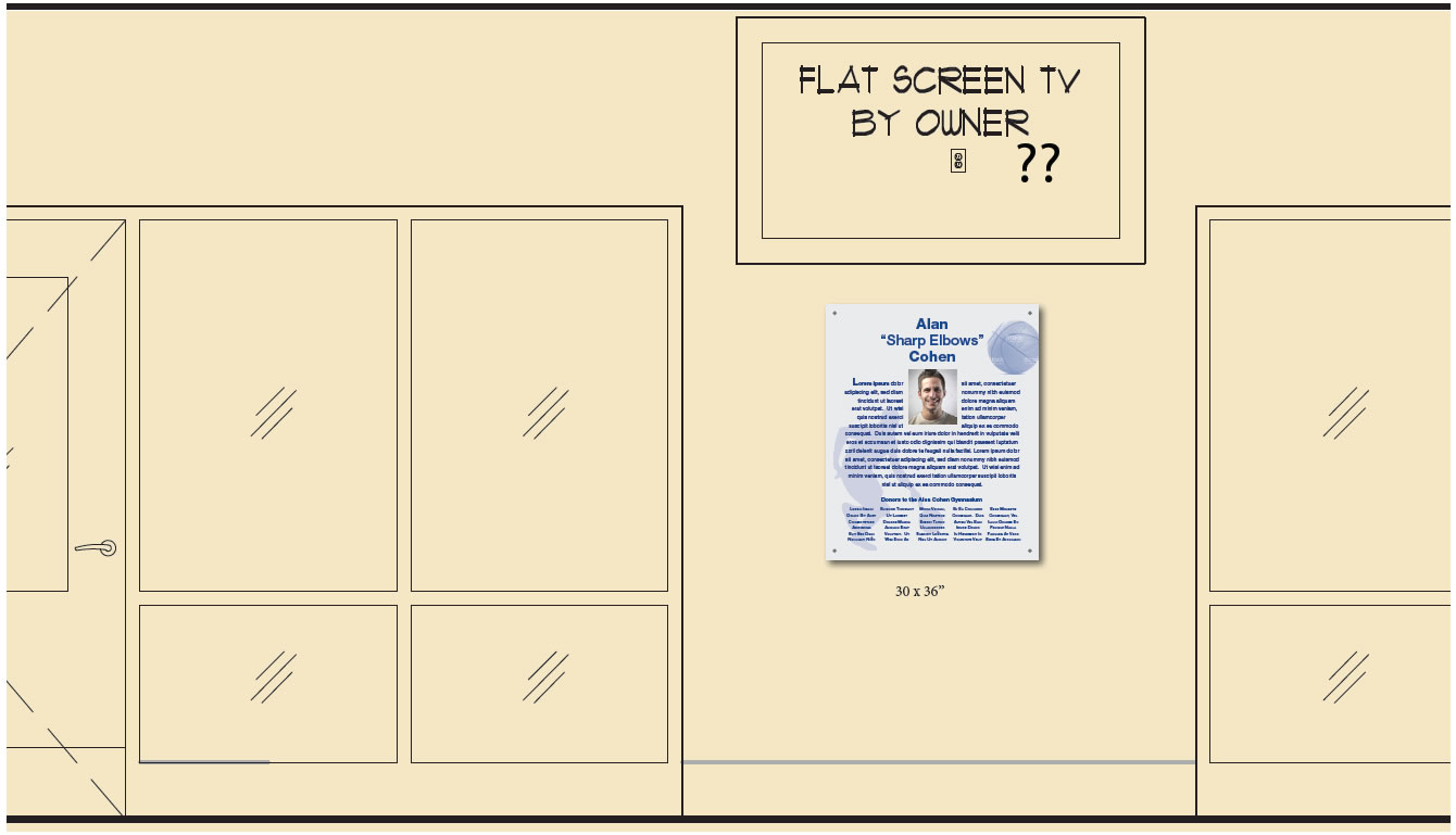
Cohen Gym panels drawings
Finished
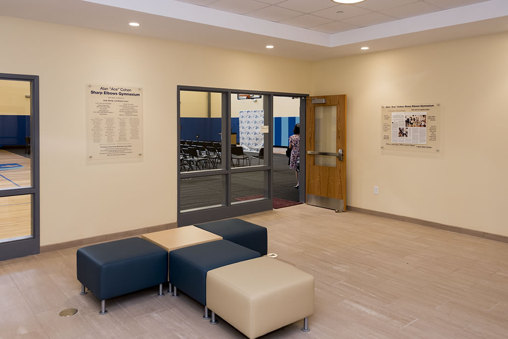
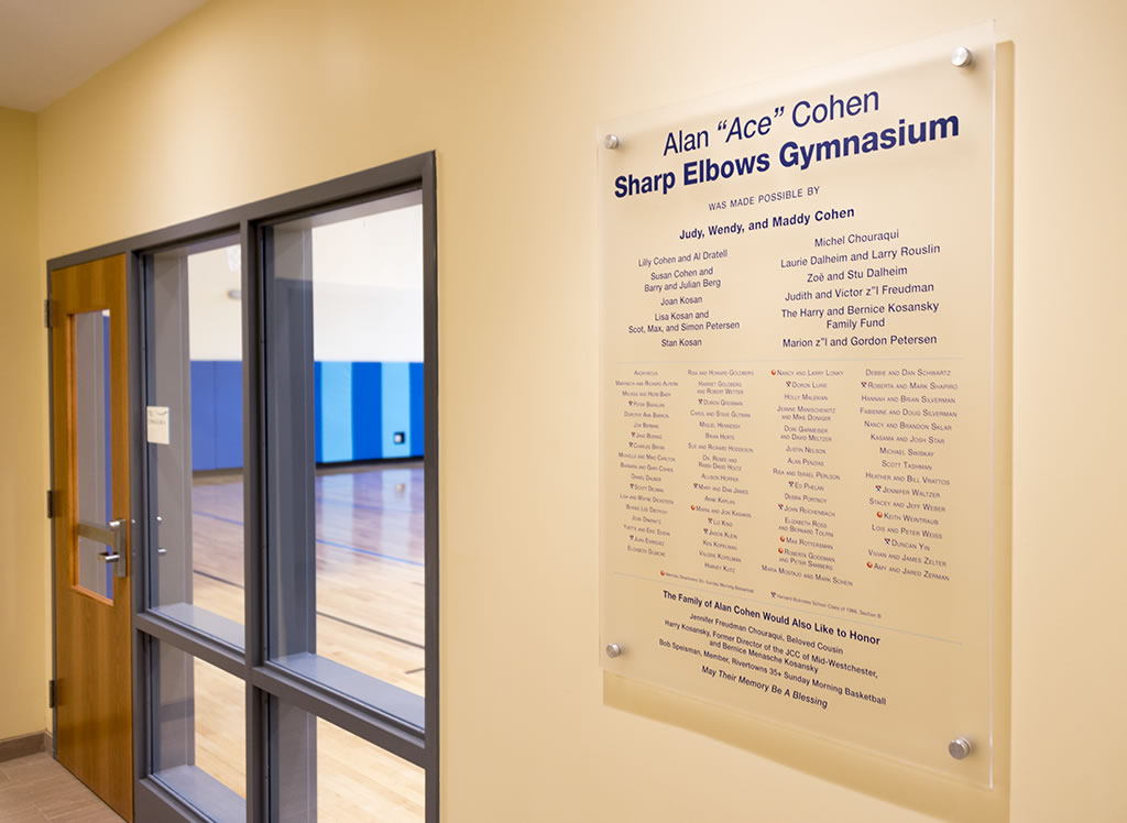
Cohen Gym final photos
Fisher Brothers' Park
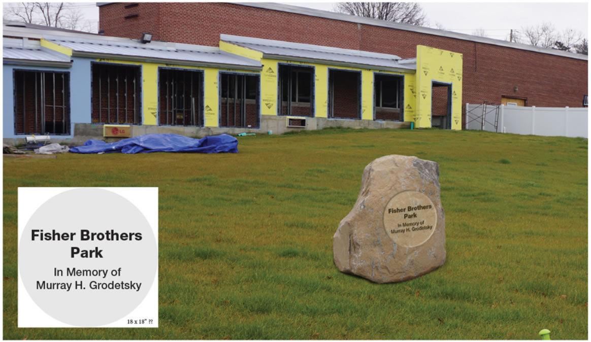
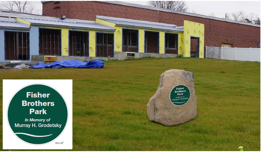
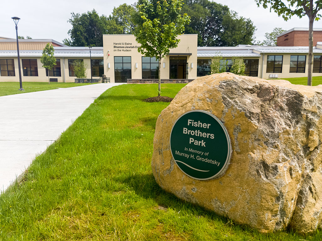
The Fisher Brothers donated to name the park area in front of the main entrance at the south side of the building. A large rock was found during the construction, and it was decided that placing a plaque on this rock would make a good marker of the park.
Concepts
Park rock renderings
Finished
Park Rock photos
Interior Wayfinding
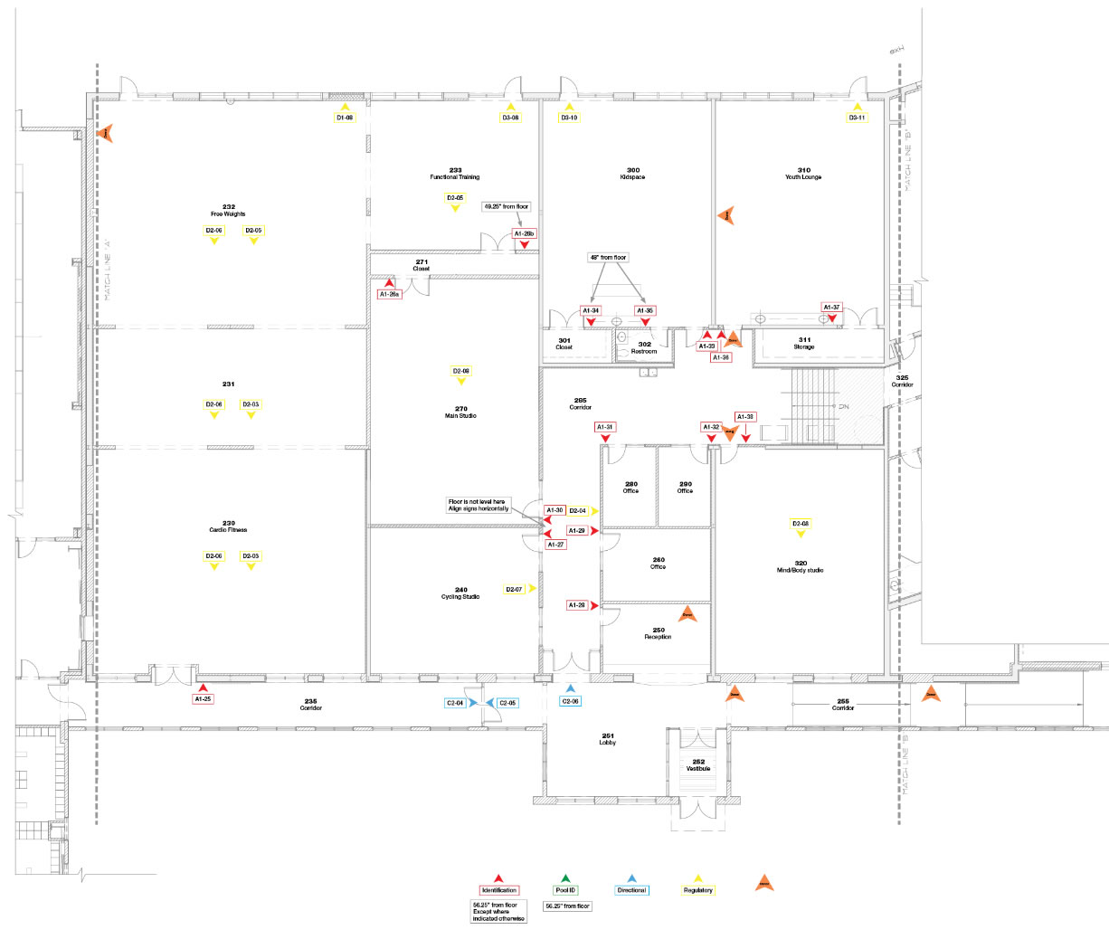
Identification
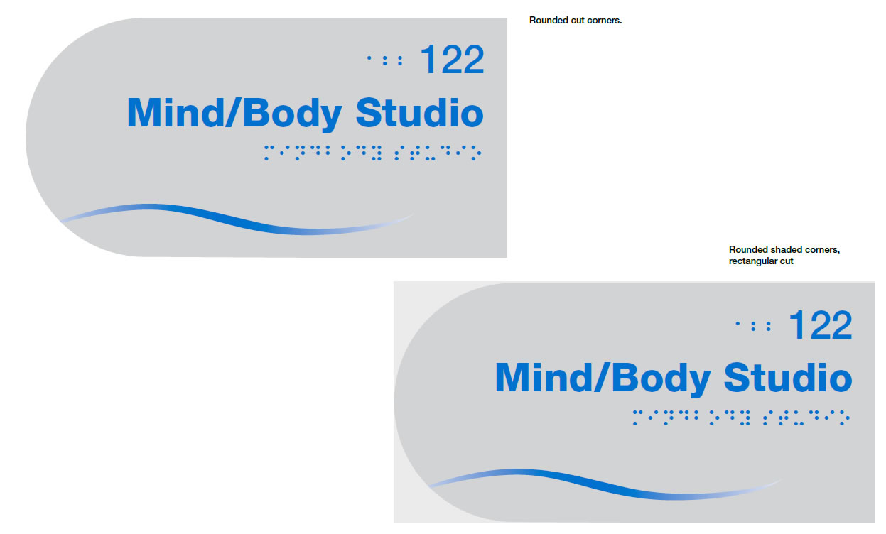
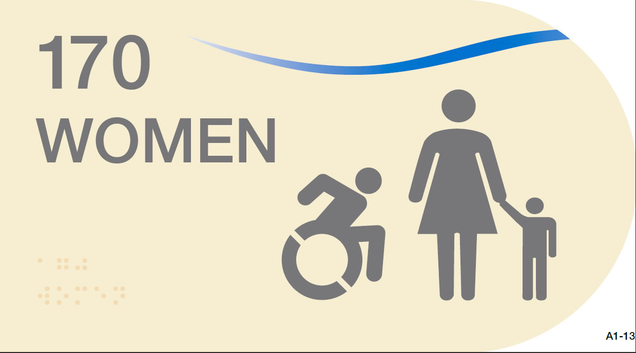
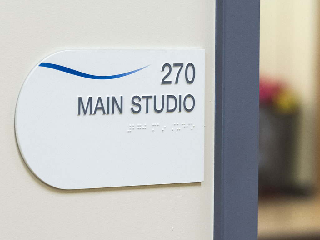
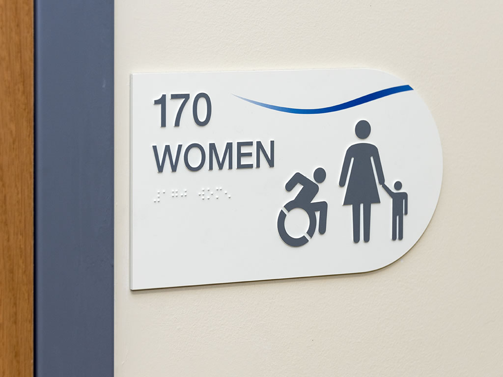
Room signs
Final photos:
Directory
Directory signage
Final Photos:
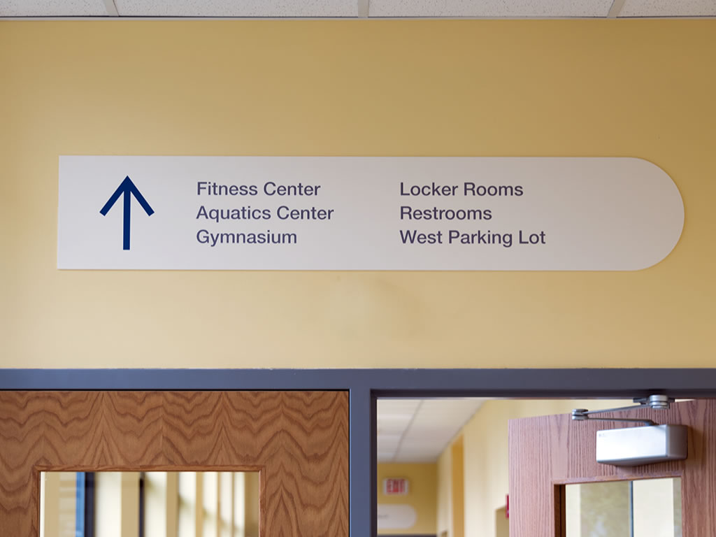
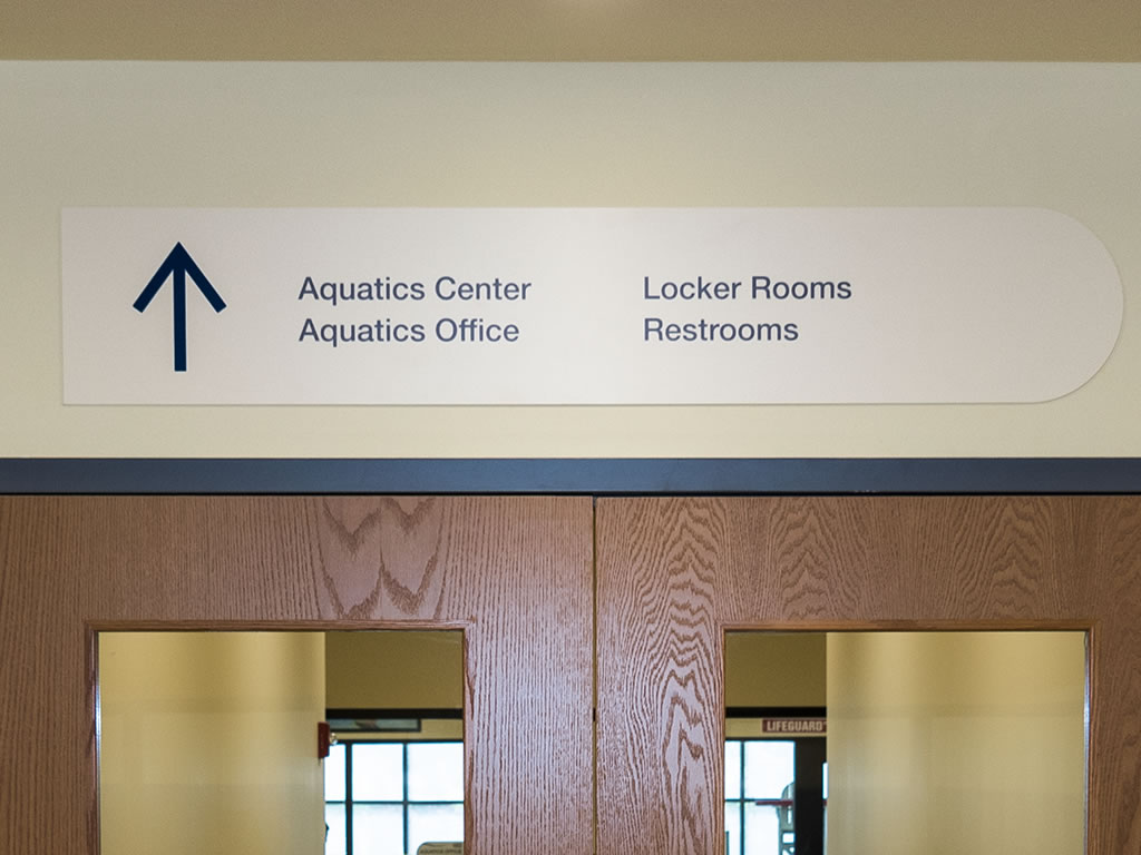
Directional
While directional signage was part of the original plan, we ended up not doing these after all.
Regulatory
Regulatory signage
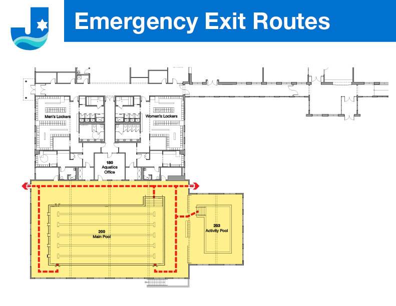
Egress
Miscelaneous
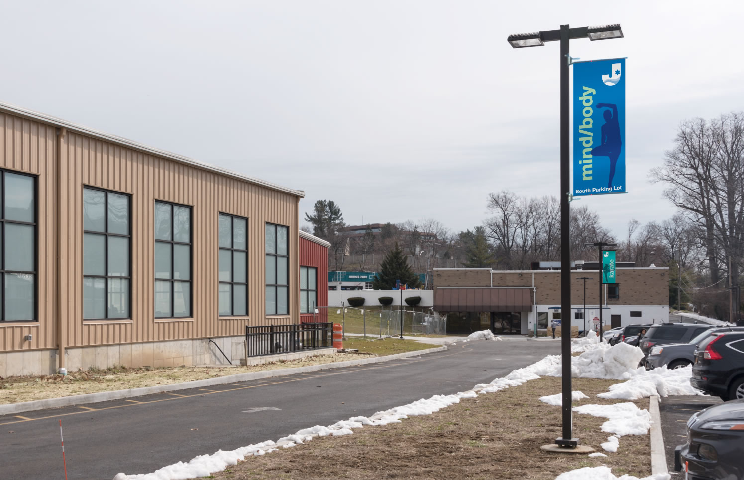
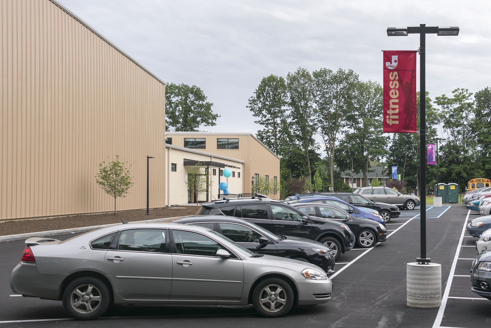
Light pole banners
Exterior parking lot pole banner mockups:
Finished exterior banner photos:
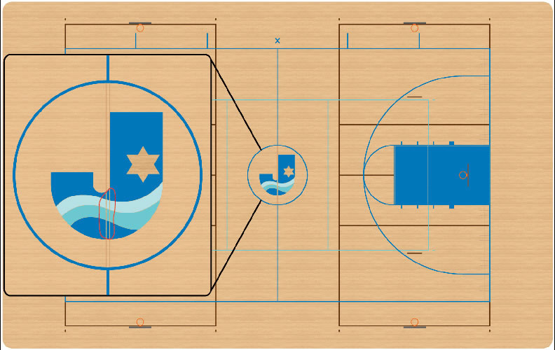
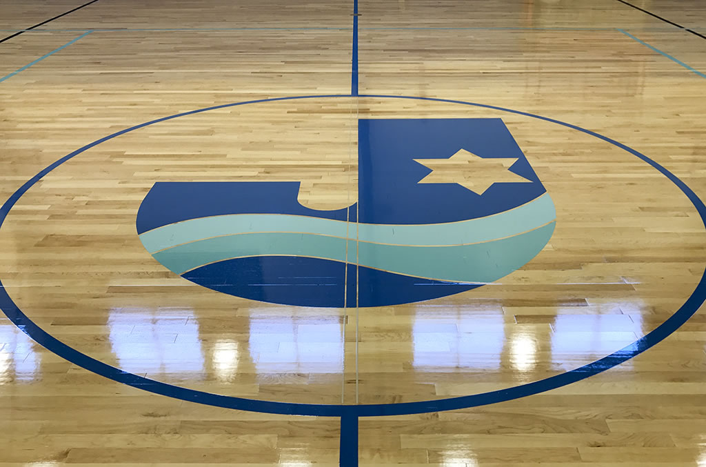
Gymnasium Floor

