Open Source User Experience Improvements
Open source software is notorious for having poor user experience design, so sometimes I design and develop my own improvements since open source projects nicely allow that.
JellyFin Home Media Server
Since Windows Media Center hasn't been supported in decades, I installed some JellyFin software in a Docker container on Debian to stream my music and videos from anywhere. Of course, I wasn't happy with the user interface, so since JellyFin is open source, it was pretty easy to customize with some CSS code that came through on all of the Xbox, laptop, and smartphone client apps used to connect to the server.
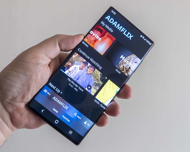
I modified the mobile app interface significantly. First I removed the cast and group watch buttons because I'll probably never need those. Then I labeled just about all of the remaining icons with the words that they were assigned for screen readers. This is a huge accessibility improvement since people can much more easily understand buttons when they are able to read the words that describe their functions. I also moved the main navigation bars to the bottom edge of smartphones in portrait mode because that's where your finger can actually access them. Thumbs don't extend their lengths, they rotate at the joint, so having buttons within thumb rotation distance means that the buttons can be accessed without the excessive motor function involved in repositioning the hand or using two hands to reach the top of the phone screen.
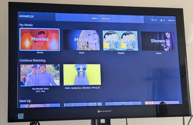
I also added text labels to the buttons through the system on all viewports so that even using the interface with a TV is easier. There are also some design niceties as well such as acrylic style blurry translucent panels as opposed to the boring solid color panels that are there by default.
Jitsi Meet Video Conferencing
Video conferencing has become seriously important since the pandemic. Consumer products like Zoom have faced major security problems, but that can be mitigated by running your own video conferencing server that no one else knows about.
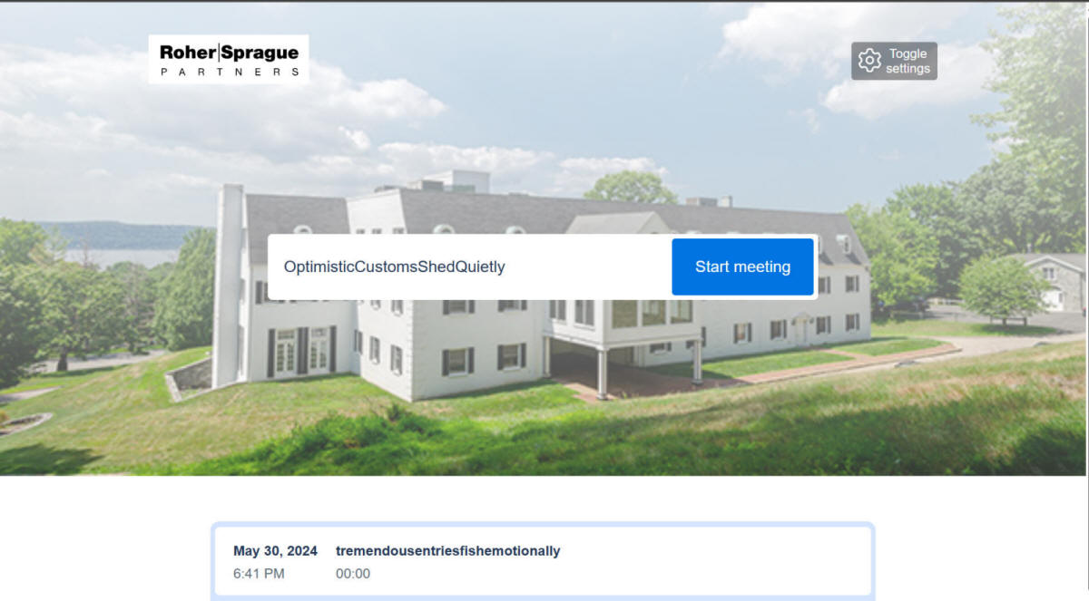
For Roher/Sprague Partners and our clients, I installed a Jitsi Meet server on an Oracle Cloud virtual private server attached to our own subdomain. Running an Oracle Cloud VPS is a lot less expensive than paying for a Zoom, Google Meet, or Microsoft Teams subscription and we have much more control over the logging, data, and security.
In terms of user experience, I went with the one-click design where joining the meeting doesn't require any personal information or log-ins or sign-ins at all; just the URL. This makes it very easy to join meetings.
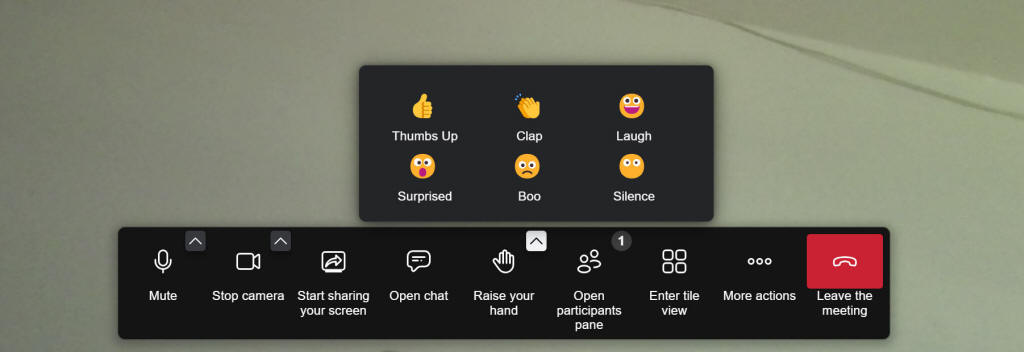
Another major usability problem with Jitsi Meet's default video conferencing user interface is that it originally only uses cryptic ambiguous icons for the buttons. This has been derided as "mystery meat navigation" for decades yet unexperienced user interface desigerns continue to make this mistake.
During literally every video conference call I had with clients and coworkers, at least one person would ask something like, "How do I share my screen?" or "How do I leave the call?" or "How do I turn on the video?" I modified the code a bit to create a much better toolbar which shows the accessibility labels in plain text for each button. This has almost entirely got rid of the "how do I" questions on video calls now since the functions for each button is now extremely clear as long as the person can read. These labels also use the language preferences of the user so that all supported languages will appear to clarify what each button does. This was a huge improvement in user experience.
Some one else actually built an Outlook Add-in for Jitsi Meet in response to one of my comments on the Jitsi forum, so we also have a nice way to create Jitsi meetings and meeting requests in Outlook.
My user experience design direction has also contributed to the redesign of the Jitsi Meet mobile app. It now has labeled navigation buttons at the bottom of the user interface that are both readable by humands and accessible by fingers since they're at the bottom edge where a thumb can reach while holding a phone.
Lein Social Mastodon Mobile web app
Of course I made my own ActivityPub compatible Fediverse instance social media network as well. My Lein Social web app is based on Mastodon and I also made some modifications to improve the user experience. The desktop size web app is fine, so most of my modifications went into the mobile version.
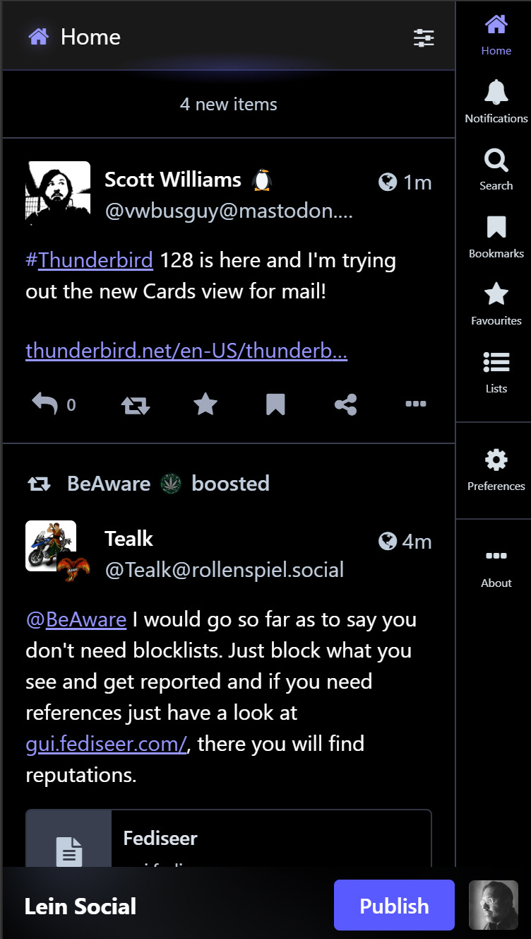
The default Mastodon mobile web app is very poorly designed from a usability and user experience perspective. There's a long column of unintelligible icons on the right that nobody can understand as well as important interactive elements like the "Publish" button at the top of the screen where your fingers can't reach.
First of all, I added text labels to the icons by showing their accessibility labels so that the interface could actually be understood in my native language. Of course, it will use whichever language preference the user has set as well. Then I moved the Publishing and profile bar from the top edge to the bottom edge where it can actually be reached by a thumb in a hand that's holding a phone. This design greatly improves ergonomics as well as cognitive ease in not having to figure out what the unintelligible icons mean (because you can read their labels.)
Home Intranet & Webmin
Since I started with designing web pages on the Digital Equipment Corporation intranet, of course I have to make my own at home.
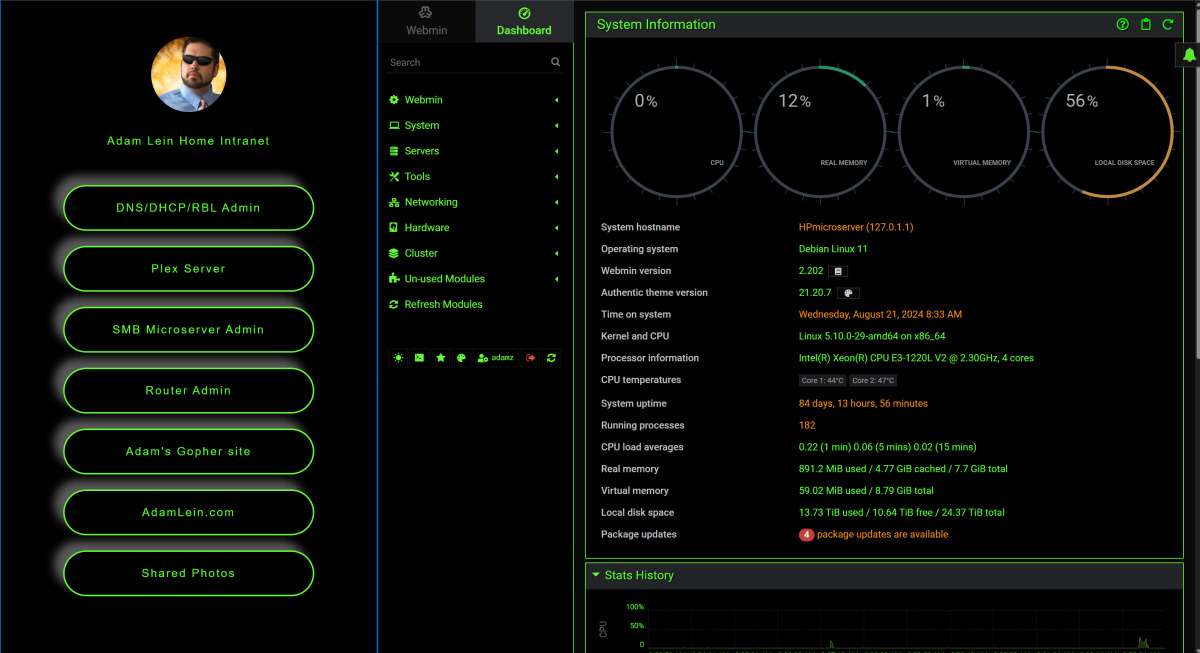
The mobile-friendly page on the left is basically my portal to intranet and network management utilities. On the right is an installation of Webmin that I customized with my own theme to match my favorite Linux XFCE style theme as well as the intranet portal.
Delta Chat Private Messaging System
I'm a big fan of the Delta Chat email client as it basically reformats emails to a modern chat style interface, but also adds features such as video conferencing, read reciepts, emoji, and even a method to share games and apps in a collaborative manner. My suggestion for adding the "Apps" menu within the messaging attachment button was implemented throughout all Delta Chat clients and makes both discovery and usage of games & app repositories much much easier for the users. My suggestion to have a setting for custom app/game WebXDC repositories was also implemented so that anyone can create their own lists of games & apps that could be available in any Delta Chat client.