Adam's Web Design Tutorial(January, 2001) This page will give you a tutorial about my favorite and most efficient web design technique. This technique makes the user interface of a website essentially independent of the site itself. The advantages to this mean site-wide redesigns without re-editing each individual content page, thus allowing for non-existent design transitions. My single file user interface technique also allows for very efficient maintenance as well as simply scalability. It also allows for less limitations than other methods such as FrontPage shared borders and Dreamweaver Templates. This technique can be used with other server side scripting methods, however this tutorial uses Active Server Pages. |
Content StructureFirst we'll start with the navigation and content structure. I like to use the FrontPage Navigation view to organize the hierarchy of pages, but it's just as easy to draw it out on paper. The navigation should organize the content into primary categories that are easy to understand. Cross-linking content pages can be created later.
Using this FrontPage navigation view will also create all of the pages in a blank web. Then you can easily add shared borders to all of the pages, and include navigation bars automatically. This is a great way to quickly create a naked website with all of the navigation structure in place. A similar, yet more complicated method is available in GoLive. Next we'll use a global find and replace feature to add our user interface includes. Optionally you can create a new page template that reflects this. Resulting blank pages should have HTML code like this:
<body>
<!--#INCLUDE FILE="Nav_top.asp" -->
<p>
Content Area
</p>
<!--#INCLUDE FILE="Nav_bottom.asp" -->
</body>
Be sure to create blank "Nav_top.asp" and "Nav_bottom.asp" pages so that the naked site won't generate errors when previewing on an ASP compatible server. We'll use the include files later to apply the user interface design to the entire site. You can now fill in the content areas for the site pages with text, etc. Or you can delegate this to some one else while you design the user interface.
|
User Interface IssuesNow lets go design a user interface! I like to start with a screen shot of a browser window in Adobe Photoshop. Masking out the browser window display area (while keeping the browser's user interface and window borders) allows you to design the site behind the browser. This is also a good way to send comps to clients allowing them to see how the site would look in the browser. I strongly recommend using a screen shot of a browser window at 640x480 window dimensions. That way you can design your site for the lowest common denominitator. Many designers target only 800x600 browser windows. Data surveys have shown that the majority of web users have 800x600 resolution screen sizes, however the data does not show the preferred window size of these users. Browser window sizes can be any dimension LESS THAN the users' screen resolution. Thusly designing sites for fixed widths at 800x600 are going to cause annoying side scrolling on smaller window sizes. This is one of the deadly sins of web design. Some have said "Well, most people browse websites full screen." Where is the data to back this information up? Browsing web sites full screen is extremely inefficient. Experienced web users will often open many browser windows in order to increase the amount of information downloaded at the same time. By cascading these windows, you can quickly see what information has finished loading in other windows while absorbing the information in the topmost window. In order to cascade windows in this manner, their sizes should be less than full screen. Requiring a full screen browser window for your website causes a significant decrease in usability among both power users and 640x480 screen resolution users. If you absolutely must design a fixed-width site for 800x600 screen resolutions, I would use an 800x600 dimensioned browser window size screen shot in Photoshop along with a 640x480 dimensioned browser window screen shot on another layer (lined up with the upper left corner). This way you'll be able to design your site while keeping the "fold" in mind. The fold is the area at the bottom and right edges of a 640x480 window size display. Content that appears beyond the fold will only be visible by scrolling on 640x480 window sizes. Designing a site with text that flows across the fold is similar to when you read a newspaper and the text runs right across the crease in the middle of the paper, going on to the next page. You don't ever actually see this in print since it makes the text very hard to read. However, many web designers to not take this into consideration. Then there are sites that create multiple vertical columns of text. This is similar to newspaper and magazine layouts where you would read the first column and then continue on to the next. The difference here, however, is that you navigate print products with your eyes. You can already see the whole page, you just have to find the part you want to read and look at it. On the web, you have to use a mouse and scroll bars to see the page. Using multiple vertical columns of text on web pages forces the user to scan through the first column, scroll down to see the rest of it, then scroll ALL THE WAY back up to see the second column, then scroll down again, scroll up, etc. People do this in attempt to make it easier to see more content at once, but it often make things more complicated and confusing. Now are we ready to design the user interface?! Almost! You've also got to decide if you want to make a fixed-width web design or a flexible-width web design. Flexible-width web designs use percentage based width attributes to expand/contract design elements depending on the users' browser window size. This technique also allows you to re-flow text to fit in the users' window without requiring side scrolling.
|
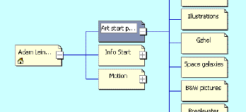
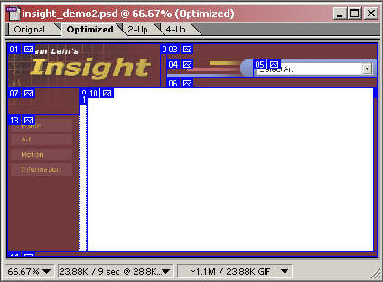
User Interface DesignOkay, now let's look at our user interface design. Shown below is a screen shot of my current website design in Adobe ImageReady 3. The graphics for the site were mostly created in Photoshop with a few elements from Illustrator and Lightwave 3D.
In the image above, you can also see slices defined for the site graphics. It's important to plan ahead during the design process. As you can see, many of my slices are solid colors... these can be replaced by using table cell background colors, thus reducing the need for bandwidth hogging imagery. Also keep in mind which cells should be in their own table. Currently ImageReady and Fireworks only export image slices in a single table, however, this is not always practical. For example, slices 1-6 in the above image should be a separate table since the content slice (#10) will contain a varying quantity of material. If slice #10 were to increase in vertical dimension (while remaining in a single table as ImageReady would have it), then slices 7, 9, 11, 12, and 13 would also have to increase and this will drastically alter the alignment of the image elements (specifically slice #7 and 9). Therefore, I will temporarily crop the image and export slices 7, 9, 12, and 13 separately. I'll do the same for slices 1-6. Then when I get the resulting HTML tables and images from the export, I'll re-build the design in FrontPage by pasting them into separate cells in a full-window table. I also want to make this design have a flexible width. As you can see, slice #2 is a solid color. I'll make that the flexible cell in the header table and define the table to have a 100% width. All other cells in the table will have pixel dimension width attributes based on the dimensions of the images contained within them. Once I've got my design built in HTML, I'll save the page as test.asp. This is just one page that we're using to build the interface, we'll apply it to the site later.
|
Interactivity ProgrammingNow it's time to add the interactivity to the site design. You could have done this in the previous step using ImageReady or Fireworks. Both programs allow you to create image slice links, mouseover animations, etc. and allow you to export them to HTML. However in this example, I didn't want to use image-based navigation since images take more time to download and they're not as easy to manage as text. Furthermore, you can store text in databases whereas images require separate files and can usually only be referenced from databases. Also, if all your navigation is image based, and you want to change or add something, you'll have to go all the way back to Photoshop and, in many cases, recreate the entire user interface. Slice #13 is where my Photoshop design placed the primary navigation. I'll delete the image in this cell that the ImageReady export had created. Then I'll add some text based code to create the buttons. My code for the "Home" link button is as follows: <% If section = "Home" Then %> <A href="default.asp" class="here">Home</a><br> <%End If%> <% If section <> "Home" Then %> <A href="default.asp" class="leftnav">Home</a><br> <%End If%> I'm using ASP code here to detect a "section" variable and then alter the appearance of the link based on the value of that variable. This requires that I place a section definer line on each content page. So.. on the Home page (default.asp), I'll put <% section = "Home" %> on the first line of the page. I'll also use this in the pop-up menu inside slice #5 to determine what section the user is browsing and then create a menu from the database which will be applicable for that section. The primary navigation buttons on the left also use Cascading Style Sheets to determine their appearance. The following is a sample of the code used to create the beveled button hover effect: a:hover.leftnav
{ background-color: #748CD6;
color: #FFFFFF;
cursor: hand;
font-family: verdana, arial, helvetica;
font-size: 11px; font-weight: bold;
height: 20px; letter-spacing: -0.5pt;
line-height: 10pt;
text-decoration: none;
width: 115px;
border-left: 2px solid #81BAF3;
border-right: 2px solid #126BC5;
border-top: 2px solid #81BAF3;
border-bottom: 2px solid #126BC5;
margin-left: 1px;
margin-right: 1px;
margin-top: 2px;
margin-bottom: 2px;
padding-top: 1px }
It's important that the "hover" subclass has the same dimensions and sizes as the default (non-hover) class. Otherwise, the mouseover (hovering) could cause undesirable flickering and movement of the text. It's best to make the hover effect simply indicate click ability without moving the link label around or distracting the user. Next, I added the context sensitive pop-up menu in the upper right corner of the site design. This combined Active Server Page programming with javascript programming to create a database driven context sensitive pop-up menu. I won't get into the details here, since it's quite complicated, but I will say that this also made use of my "section" variable definitions located at the top of each content page.
|
Pocket PCsThen, I'll add a little Pocket PC detection program to the top of the user interface page. This will detect a small-screened Pocket PC browser and reformat the entire website with a user interface tailored to the device. <% 'Check for Pocket PC
if
(InStr(Request.ServerVariables("HTTP_UA_OS"),
"POCKET PC"))
then %>
<body topmargin="0" leftmargin="0" rightmargin="0"
bgcolor="#FFFFFF">
<Table Width="100%" Border="0"
CellPadding="0" CellSpacing="0">
<tr><td bgcolor="#53060D" >
<font color="#FFFFFF">Adam Lein's Insight
</font></td>
</tr>
<Tr>
<Td bgcolor=#CCCCCC>
<a href="default.asp">Home</a> |
<a href="art_strt.asp">Art</a> |
<a href="movi_strt.asp">Motion</a> |
<a href="infostrt.asp">Info</a> </td></tr>
<tr>
<td>
<% else %>
<!-- begin code for other browsers -->
Don't forget to put an <% end if %> line at the end of the include just before the content area.
|
Browser Compatibility IssuesMicrosoft Internet Explorer is the most popular web browser and it's also the easiest to design pages for. However, many people still use other web browsers such as Netscape. Furthermore each different version of each browser type supports a different set of tags with varying degrees of stability. The Following VB Script code can be used on the server side to detect browser versions and set variables to use for compatibility issues elsewhere in your user interface code. <% Dim sAgent,b_IE,b_Vers,b_Mac,b_Nav,b_Other Dim ie4win,b_win,ie4,ie3,ie4mac,ns4 b_IE=false b_Nav=false b_Other = false b_Vers = 0 sAgent = Request.ServerVariables("HTTP_USER_AGENT") if (inStr(sAgent,"MSIE")>0) then b_IE=true b_Vers = Mid(sAgent,inStr(sAgent,"MSIE")+5,1) elseif (inStr(sAgent,"MSPIE")>0) then b_Vers = Mid(sAgent,inStr(sAgent,"MSPIE")+9,1) else b_Vers = Mid(sAgent,9,1) end if if (not (b_IE)) then b_Nav=inStr(sAgent,"Mozilla")>0 or inStr(sAgent,"compatible")>0 end if b_Win = (instr(sAgent,"Win")) > 0 'Windows b_Mac = (instr(sAgent,"Mac")) > 0 'Mac b_Other = not (b_Win or b_Mac) 'Other ie4 = b_IE and b_Vers>=4 ' IE4 ie5 = b_IE and b_Vers>=5 ' IE5 ie3 = b_IE and b_Vers<4 ' Everything <IE4 we consider IE3 ie4Mac = b_Mac and ie4 ' IE4 Mac ns4 = b_Vers>=4 and b_Nav ' NS4 ie4Win = b_Win and ie4 and not b_mac ' IE4 Windows %> You could even use this technique to have a drastically different user interface design appear depending on what browser the viewer is using... WITHOUT having to create a different version of the entire site. This comes in very handy if you ever update your site content, you won't have to do it twice.
|
Apply the DesignNow lets apply the design to the website. Open the blank include files that we created in the beginning: Nav_top.asp and Nav_bottom.asp. Now in the test.asp page (where we built/programmed the design), copy all of the HTML/ASP code above the content area cell and paste it into Nav_top.asp. Then copy everything below the content area cell and paste it into Nav_bottom.asp. Save both pages to the server and, provided you did everything right, you're done! If you had shared borders in your "naked" site, you can remove them now.
|
More RantingDancing BaloneySometimes you might like to try to bring a little
"coolness" into your website design by using some animations. It is
often quite difficult to do this tastefully without creating a usability
nightmare. There are a lot of what I call "throw-away" sites out there
that overload themselves with high bandwidth animation driven multi-media
and little actual content. Most of the movie marketing sites and
automotive corporate sites use this technique. Supposedly this gives
users a sense of coolness. However, when it comes time to actually try
to use the site to find some sort of information or, God forbid, content...
the task becomes extremely difficult and frustrating. If there
actually was any information worth using, you wouldn't know it with all the
dancing baloney. This is the
reason I call them throw-away sites... a user will go there once,
download lots of cool animations (they're only cool the first time), then
leave and never come back. If you've actually got any content worth
sharing, then I should think it would be worth making it accessible to the
people you want to share it with. There's no Paper on the InternetMany web designers, who come from a print background, think that they can use the same design techniques on the web as they do in print. This is a grave mistake for many reasons. Firstly, the internet is an entirely different medium than paper. The designer can choose the display dimensions of a piece of paper. On paper, designers can use a multitude of fonts and typography techniques to add emphasis to text or make it easier to read. On paper, a user will be able to actually handle the medium and see the entire page at one time. The user can also get a sense of the quantity of content on a piece of paper with one quick glance. All of these things are not true with web pages. The Internet is not TelevisionOther web designers come from an animation/multimedia background. These designers like to create multimedia-rich websites that have sounds and animations and videos. Lots of exciting stuff! Usually, you find this type of media in the movie theaters and on television. Content rich in visual and audible stimulation is meant to entertain the user. The audience isn't actually a user at all, they simply sit and watch in order to absorb the information. And if the information being displayed is not pertinent to the viewer's interests, then the viewer will quickly change the channel. This is also true on the internet. If a user is not interested in what you are feeding them, then they'll leave. And if the user must interact with a web application, the user expects an immediate response from the application. Prolonging the interaction with animated eye-candy is only captivating the first time. Users quickly become impatient and annoyed by repetitive animation. Some problems with the multimedia rich interactive television concept of web design are as follows: Even if everyone did have high bandwidth internet connections, high bandwidth multimedia rich web sites take up allot of server and client resources; resources that could be used for more important things (like serving multiple users). The internet was not designed for multimedia. It was invented to share information with many people across great distances. And in our society, the most common method of information sharing is through text. Text is much much faster to download than binary images, audio, video, and animation files. Websites are ToolsWebsites are primarily used as tools for sharing information. And like any other tool, the functionality of the design should be a priority. Any architect will tell you that there are certain rules you have to follow in order to design a building that supports itself and also allows people to use it. For example, you wouldn't put triangular or circular doors on a building. The irregular shape offers no advantage to placing hinges on the door or letting people pass through the door. In fact, an oddly shaped door would likely be more difficult to use. And certainly no architect would ever create doors that follow people around and make prolonged sound effects when they open.
|
Home | Contact | Guestbook | Link Tree | Book of AdamZ
Copyright 1995-2026, Adam Z Lein All artwork property of Adam Lein, unless otherwise noted. This site uses Google Analytics to track usage.