A Brief History
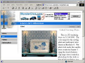
Originally this site began as "Adam Lein's Bookmarks" in
mid 1995. Using Netscape 1, it featured lists of links as well as
a picture of me and my motorcycle along with a tiled background image.
The site was created by editing the HTML file generated by Netscape to use as
the bookmarks menu.
With the advent of Netscape 2.0, I redesigned the site to make use of many of the new tags. This site was called "Adam Lein's cool" who's title was suggested by my friends (as it is during most redesigns), and featured a Java applet animation of me bicycling across the screen. Also, I made an animated GIF of a keyboard that typed out the name "ADAM" and a JavaScript pop up for displaying my artwork.
Next came Netscape 3.0 and IE3. Along which, I designed the new "Adam Lein's Puzzled" web site which made use of a number of the new tags that IE3 offered as well as some Flash technology from Macromedia. This site was extremely bandwidth intensive at the time however, and was deemed unsuitable for average users.
Then with IE4, I created "Adam Lein's Real" web site. A dark earth toned site design which concentrated more on content than fluff. It still used frames and had numbered links for access to the content in each section. I also started using CSS and dynamic HTML for some of the programming here.
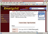
And then we had "Adam Lein's Insight"! This site was designed to be easy to update and easy to alter. With FrontPage extensions, I can change things directly on the server without having to use FTP. It's also designed for simple navigation (as always) and ease of use. Again we've cut down on the fluff and other distracting annoyances.
February, 2000
During the spring of 2000, "Adam Lein's Insight" went through a number of enhancements, including a move to an NT4 IIS4 web server and then to IIS5 and Windows 2000 AS. This allowed me to create dynamic secondary navigation using XML and FrontPage categories... which makes adding content a matter of creating a new page (using my online template), adding the content, and saving the page with the proper category checked off. Since the categories server side component does not allow for specific tag editing, I used a secondary style sheet to control the appearance of the tables that are generated dynamically.
September, 2000
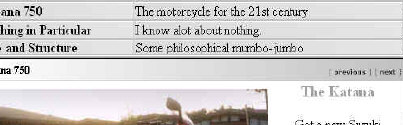
In the Fall of 2000, I added shared bottom and top borders which are added to my content pages dynamically from single border files. The top border also includes dynamic links to previous and next documents within the section. The title of the page is also displayed automatically in the top border, within a style sheet based gradient blend. On my Katana motorcycle page, there are a series of thumbnail images that link to a single active server page which loads the selected image and displays it's file name in the title bar. Another minor enhancement was some new main category icons which combine style sheet hover effects with text and images.
January 1, 2001
As of January 1st 2001, my site was rereleased with a new design and a new name; Adam Lein's Millennium. Firstly, all content pages were renamed with the ASP extension. Then I simply added a server side include statement to the beginning and end of each page. The entire user interface was rebuilt to reside in two include files (a beginning and an end). Now, my beginning include file was what does most of the work. The end file only closes off the open tags. So, I can control any user interface changes from basically a single file. I wrote code for this file that would alter the appearance depending on what primary section the user was visiting. This is visible by the different UI imagery and the button style differences. I also included code in the user interface file that would alter the design drastically for viewing on a small screened Pocket PC Device. To see how this looks, click here. To see a comparison of a page in this site viewed in a Pocket PC and on Internet Explorer 5.5, click here. My single-file user interface makes alterations much easier than ever before!
May 8, 2001
Another redesign!! This one I like to call "Adam Lein's Insight XP." This one removes the banner ads from the previous design and also integrates a database driven user interface with dynamically generated pop-up menus. As with the previous design, this site makes use of my independent UI technique. We've also got a great new color scheme that compliments the browser interface design of MSN Explorer, as well as my personal desktop theme, and other normal browsers. And, not to worry, Pocket PCs and Windows CE is still detected and supported on all pages.
December 1, 2002
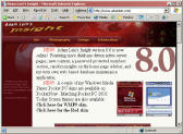
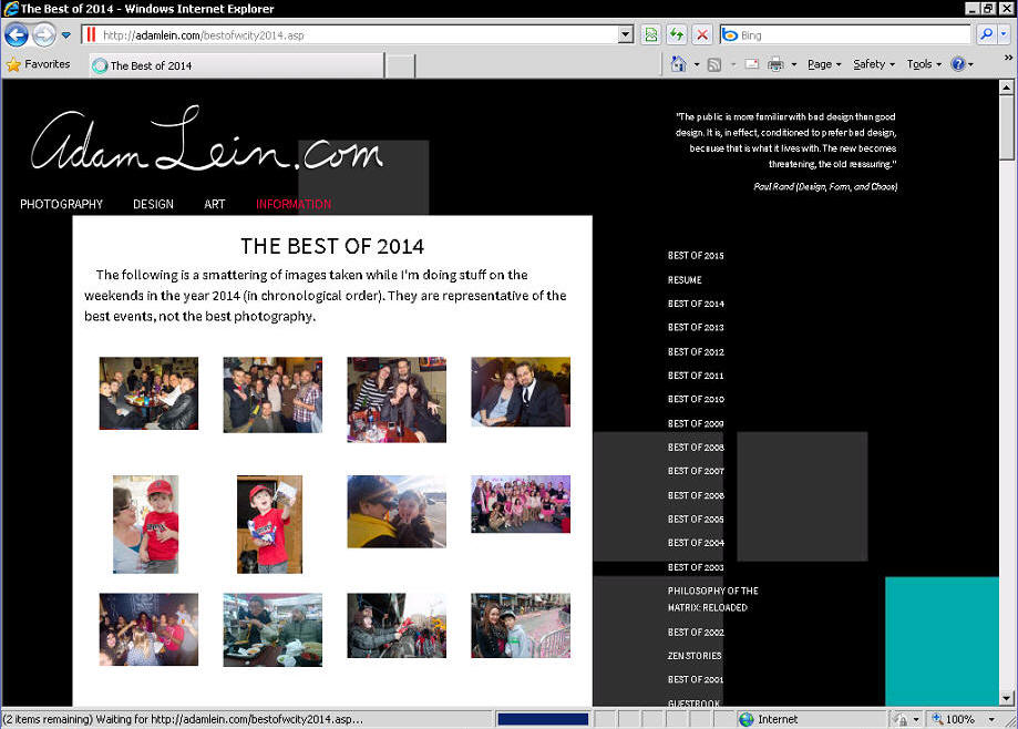
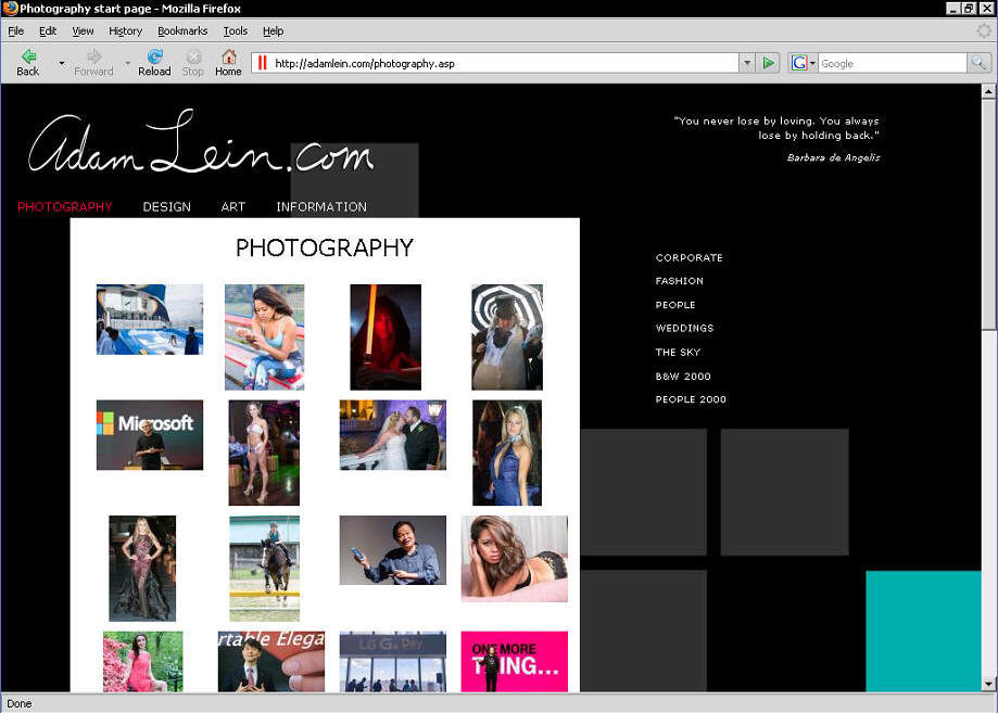
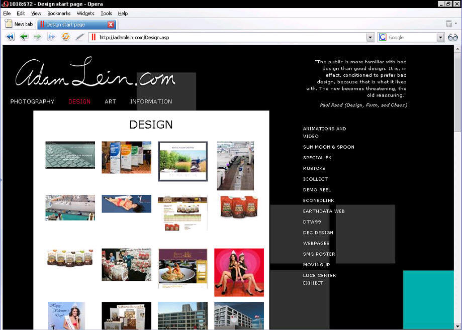
"Adam Lein's Insight v.8.0" now online. This design has a similar look to the previous version, but now with more imagery in the user interface. It's also got much more database driven content, including database driven galleries, and a random quote generator on the home page. I've also added a bunch of new content. The new galleries display thumbnails defined in the database and then the page that displays the full version also has Previous and Next buttons which allow the user to scroll through the other images. The Prev/Next buttons are also generated with server side scripting. We've got a password protected members section, and my very own web based database maintenance application. The "section" variable identifier on each page (which tells the UI how to adjust to it's location), is now generated dynamically through a query to the database which finds out it's section name based on server variables that determine the local file's filename. The programming is implemented on every page as an include file. Also each primary section page includes a database generated list of the pages associated with that section along with a gallery if applicable. Other ASP scripting is used to generate CSS class names for table properties and link items.
July 28, 2007
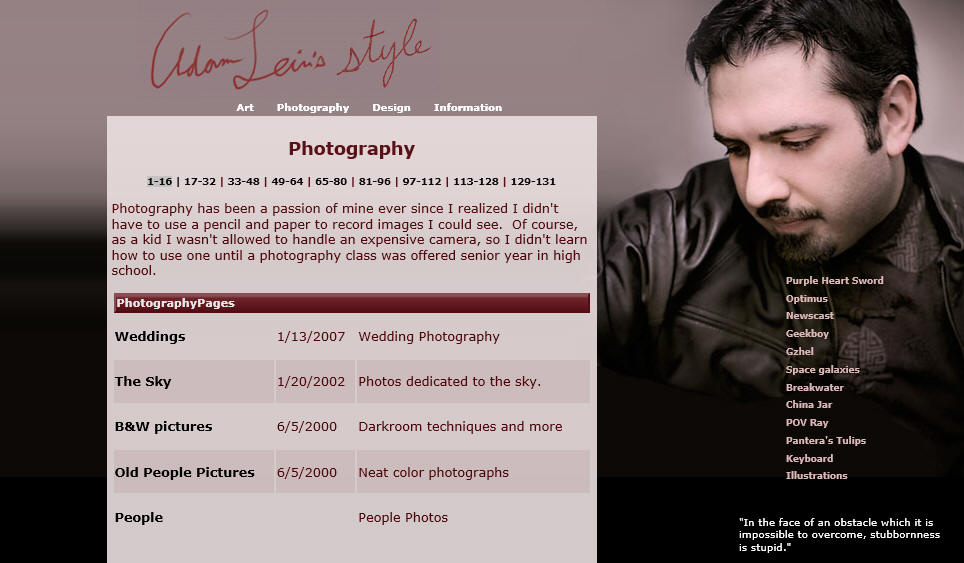
Wow! It's been forever since I did an update to this site! Well, it's about time. 6 years of "Adam Lein's Insight" and now we're up to "Adam Lein's Style". Now we've got a new layout with the usual adaptive width for mulitple window sizes. A special new feature is the random quote generator that displays quotes from my collection in the database.
January 1, 2013
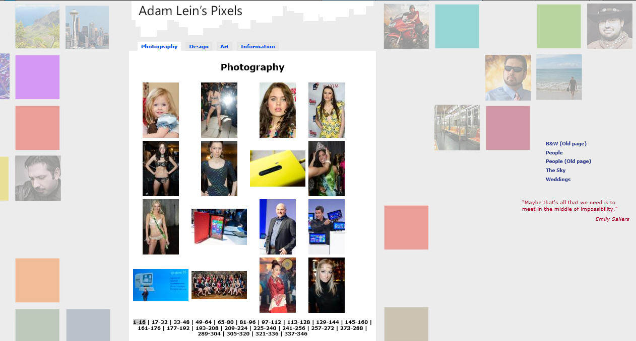
Another 6 years later and it's time for a new design. Adam Lein's Pixels uses a square image layout background with a much lighter weight than the previous design. This style keeps the layout pretty much the same since there was so much other work I had to do. For example, the hosting service upgrading their servers and thus made my database inaccessible to my programming. So that part had to be updated. Then I had about 2 years of photography to sort through and add to the Photography section. Maybe the design section will get an update too.
January 13, 2016
 It's been 3 years since my last redesign and
this time I've edited almost every page to support new HTML5 responsive layout techniques. I've altered the
beginning/end includes to have some minor changes to the interface code, but just about everything was done
with CSS. I've got a new full-window background slideshow that animates on every page and also resizes with the
window size. Actually there are multiple sets of background slideshows that load randomly. Many content pages
have been updated with modern coding techniques and I used a lot of variable regular expression find/replace
scripts to speed that up.
It's been 3 years since my last redesign and
this time I've edited almost every page to support new HTML5 responsive layout techniques. I've altered the
beginning/end includes to have some minor changes to the interface code, but just about everything was done
with CSS. I've got a new full-window background slideshow that animates on every page and also resizes with the
window size. Actually there are multiple sets of background slideshows that load randomly. Many content pages
have been updated with modern coding techniques and I used a lot of variable regular expression find/replace
scripts to speed that up.
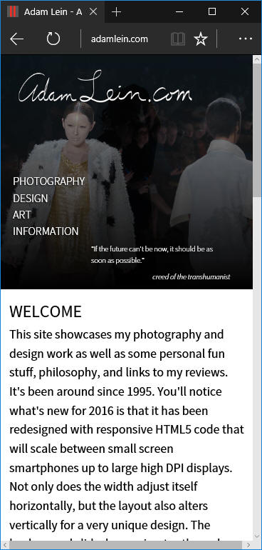 There are media query breakpoints that
alter the design further for small-screen mobile devices and high-DPI screens. The layout completely changes as
you change the browser window size both horizontally and vertically. Not many sites are vertically responsive
so I believe this is a pretty unique design. Some of the photo galleries now have touch-friendly image viewers
that you can swipe through. We've also got a bunch of new content as well, and some enhancements for Facebook
sharing as well as app icons for phones. Overall, updating this site for an HTML5 responsive layout was a lot
of effort, but it was worth it.
There are media query breakpoints that
alter the design further for small-screen mobile devices and high-DPI screens. The layout completely changes as
you change the browser window size both horizontally and vertically. Not many sites are vertically responsive
so I believe this is a pretty unique design. Some of the photo galleries now have touch-friendly image viewers
that you can swipe through. We've also got a bunch of new content as well, and some enhancements for Facebook
sharing as well as app icons for phones. Overall, updating this site for an HTML5 responsive layout was a lot
of effort, but it was worth it.
Everything is designed to maintain most functionality with old browsers too, as any web designer worth his salt would ensure. IE 7, Firefox 2, Opera 9, etc., should all work fine. Of course some features and design will be slightly different, but it should all stay readable and workable.
February 26, 2019
Just a little update this time. I updated the contact form to reduce robot spam, and I added a sticky footer navigation bar that only appears on the mobile site and only on pages that become really long in the responsive mobile version. I'm pretty proud of this since it's very quick, very usable, and very code-efficient. It's also got some cool backdrop filter transparent blur styling on iOS and Windows Edge (the browsers that currently support that feature) with fallbacks for other browsers of course. Having the sticky navigation bar at the bottom of the screen makes a lot of sense while using a phone, too, since obviously your fingers can't reach the top while holding any of today's large-screen devices.
Getting back to that contact form... I spent a couple months monitoring the spam by tagging it and sending it through a filter to see how my form modifications were working. After that I implemented my own little randomized turing test that has been working really well. I also added it to the old Guestbook, so that's back online!
September 10, 2019
Another little update that adds "prefers color scheme" theme support. So now if you set your device or browser to its "dark mode" theme preference, my site will adjust accordingly. It'll do the same if you choose a "light mode" theme. Most smartphones and web browsers are adding support for this feature in 2019.
May 29, 2021
I rewrote all of the backend code in PHP just in case I want to stop hosting on Windows Server and IIS someday. Switched to MySQL for the database as well. There's a new contact form with even better anti-bot protections, too. A lot of CSS changes are in this update. On larger screens the site now adjusts to fill the screen a bit better. We've also got some new accessibility enhancements such as a "Skip to Content" link that screen readers and keyboard navigation will get you right away with a tap of the tab key. There are also some access keys for a few things, such as the main nav menu. We've got a new random background generator that also adds a video occasionally instad of the animated slideshows. Most of this was done on Manjaro XFCE with Visual Studio Code so as I could learn something new there as well.
April 22, 2023
My hosting provider disabled the local server's email sending capabilities, so I had to re-do my contact forms as well as some private apps like the photo sharing and "Call Adam" web apps to use a different method of email sending. I learned how to combine PHP Mailer with the Form Spammer Trap code. This is a lot better than using the local host mail sender since now I can set whatever SMTP server I want, plus sign messages with DKIM and encrypt them with TLS. PHP Mailer even supports OAuth, but I didn't figure that out yet.
A while back after giving someone I met my website address, I noticed as she was looking at the photo galleries, she tried to swipe the phone's touch screen to navigate to the next picture. So I added some javascript that would actually enable those touch gestures to function as previous/next buttons. This works in the photo gallery page listings as well as the single image display pages.
There have been other issues with the Easyhost1 hosting provider this year as well. One time all of the server files were deleted so I had to restore from an offline backup. Another time the whole account got disabled because it went over the 10Gb alotment of disk space usage because somebody turned on automatic backups to the server and my 5Gb of usage instantly doubled. Those were pretty easily resolved, but still, that's pretty annoying. So I started figuring out how to migrate all of my sites to Oracle Cloud to run on an Ubuntu virtual server with an Ampere ARM processor and 6Gb of RAM. I switched from Windows Server 2019 and IIS to Linux, NGINX, MariaDB, and PHP 8.2. There were some issues I had to push through, such as the left-over user.ini files from Windows Server that messed up PHP, or the database names with title case that had to be switched to lowercase in the SQL select code, but that wasn't too bad.
June 24, 2023
Migrated this site, my web apps, and blog to an Oracle Cloud virtual private server running Ubuntu Linux with NGINX, MariaDB, and PHP 8.2 and reissued SSL certificates. Upgraded the "Call Adam" app a bit too with a permissions error. Upgraded the photo gallery web app with password protection as well and moved that to a different URL. Fixed some graceful degredation issues to work better if the site is loaded with no javascript, too.
December 15, 2023
Added a lot of new content and fixed up the print style sheet so that when you print a page, things are more readable and hyperlink locations are included. Added support for operating systems and browser reduced-motion preferences.